ShopDreamUp AI ArtDreamUp
Deviation Actions
Ruby Draakonian
Woah! Your getting into some juicy content! There's some really cool things in here >.>
$25/month


Suggested Deviants


Suggested Collections


![Dovev [CM]](https://images-wixmp-ed30a86b8c4ca887773594c2.wixmp.com/f/8911a670-f1c0-4e06-b63f-04ca82f28499/deapzla-de0a7531-20bb-47a6-8a72-d2a240e8e082.png/v1/crop/w_184,h_184,x_0,y_15,scl_0.10823529411765/dovev__cm__by_lamp_p0st_deapzla-92s-2x.png?token=eyJ0eXAiOiJKV1QiLCJhbGciOiJIUzI1NiJ9.eyJzdWIiOiJ1cm46YXBwOjdlMGQxODg5ODIyNjQzNzNhNWYwZDQxNWVhMGQyNmUwIiwiaXNzIjoidXJuOmFwcDo3ZTBkMTg4OTgyMjY0MzczYTVmMGQ0MTVlYTBkMjZlMCIsIm9iaiI6W1t7ImhlaWdodCI6Ijw9MTE5MiIsInBhdGgiOiJcL2ZcLzg5MTFhNjcwLWYxYzAtNGUwNi1iNjNmLTA0Y2E4MmYyODQ5OVwvZGVhcHpsYS1kZTBhNzUzMS0yMGJiLTQ3YTYtOGE3Mi1kMmEyNDBlOGUwODIucG5nIiwid2lkdGgiOiI8PTkwMCJ9XV0sImF1ZCI6WyJ1cm46c2VydmljZTppbWFnZS5vcGVyYXRpb25zIl19.6_-WCii8BCfQN3T_sjZzOAO-hAPaznfpVEAHh0ePu0g)
![Dovev [CM]](https://images-wixmp-ed30a86b8c4ca887773594c2.wixmp.com/f/8911a670-f1c0-4e06-b63f-04ca82f28499/deapzla-de0a7531-20bb-47a6-8a72-d2a240e8e082.png/v1/crop/w_92,h_92,x_0,y_7,scl_0.054117647058824/dovev__cm__by_lamp_p0st_deapzla-92s.png?token=eyJ0eXAiOiJKV1QiLCJhbGciOiJIUzI1NiJ9.eyJzdWIiOiJ1cm46YXBwOjdlMGQxODg5ODIyNjQzNzNhNWYwZDQxNWVhMGQyNmUwIiwiaXNzIjoidXJuOmFwcDo3ZTBkMTg4OTgyMjY0MzczYTVmMGQ0MTVlYTBkMjZlMCIsIm9iaiI6W1t7ImhlaWdodCI6Ijw9MTE5MiIsInBhdGgiOiJcL2ZcLzg5MTFhNjcwLWYxYzAtNGUwNi1iNjNmLTA0Y2E4MmYyODQ5OVwvZGVhcHpsYS1kZTBhNzUzMS0yMGJiLTQ3YTYtOGE3Mi1kMmEyNDBlOGUwODIucG5nIiwid2lkdGgiOiI8PTkwMCJ9XV0sImF1ZCI6WyJ1cm46c2VydmljZTppbWFnZS5vcGVyYXRpb25zIl19.6_-WCii8BCfQN3T_sjZzOAO-hAPaznfpVEAHh0ePu0g)


You Might Like…


Featured in Groups


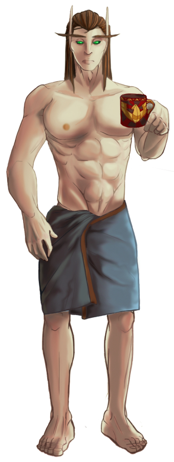
Description
Played with it. Tried some new coloring techniques. Played with a multiply layer and tons of overlay combinations...
This is a few hours invested, but I reiterate that this is a learning piece.
And I need to figure out ways to continue improving!
Anyway. Yeah.
This is a few hours invested, but I reiterate that this is a learning piece.
And I need to figure out ways to continue improving!
Anyway. Yeah.
Image size
340x900px 172.87 KB
© 2012 - 2024 Fffaraji
Comments6
Join the community to add your comment. Already a deviant? Log In
I think this is awesome for a start in anatomy! I'm glad that artists who actively seek criticism still exist. <img src="e.deviantart.net/emoticons/s/s…" width="15" height="15" alt="
There are a few things that I can see that seem slightly off. Like Snuggle-Pounce said, his abdomen is pinched down into his navel. As an example of what it should look like, take a look at this picture (credited to <img class="avatar" src="a.deviantart.net/avatars/v/i/v…" alt="
 " title="vishstudio"/> ) -
[link]
While it's not facing the same direction, you can see that abdominal muscles are much more compact and built upon one another, rather than wide muscular structures with lots of space in between them. A way that you could fix this is by simply relocating the bone arch of his hips lower down so that they just peek over the edge of the towel. Don't ever be ashamed to use reference - that's how we all grow as artists!
Now on to his legs and feet. In proportion to his upper half, his legs seem a bit short and on the skinny side and his feet look rather box-like because they don't have arches. Additionally, it kind of looks like he's hovering in midair because they aren't on the same plane the rest of the body falls on. Here's another reference (AGAIN credited to <img class="avatar" src="a.deviantart.net/avatars/v/i/v…" alt="
" title="vishstudio"/> ) -[link]
His feet look flatter, longer, and more direct to the eye because he is actively engaged with a surface - I know perspective can be tough, but try it out next time! A way to fix those shorts legs would be to elongate and show more of the thigh so that you can see some of the thicker muscular structure attached to the inner thigh.
The last thing that I'll mention anatomy-wise (bear with me, I'm almost done) is the perspective on the arm holding the cup and the hand holding the handle of the cup. His forearm would be close to the body, rather than facing outward, and his hand would grasp the handle instead of holding it as uncomfortably as he seems to be doing. This is the closest image I could find to illustrate what I mean:
[link]
![[link]](https://www.deviantart.com/users/outgoing?http://i.istockimg.com/file_thumbview_approve/8640116/2/stock-photo-8640116-tired-man-holding-coffee-mug.jpg)
The only thing I'll mention about your coloring technique (because I actually quite like the coloring on this one) is that the light source seems to be all over the place! I'm not quite sure where it's coming from. Always remember that warm light promotes cool shadows and that cooler light sources promotes warm shadows, as well.
Overall, I think this is an excellent try for a learning piece. Mind you I'm not the most terrific artist out there, but I'm happy to help anyone who wants to learn. <img src="e.deviantart.net/emoticons/s/s…" width="15" height="15" alt="